How to Use Pivot Tables in Excel to Build Sweet Sales Reports


Romy Ribitzky
By John Short, Marketer at Yesware
As a marketer, I am always using Excel to analyze data, pull together reports, and project future activity. Salespeople use it much the same way. You need to provide daily, monthly, and quarterly sales reports for yourself, your team—and often for your superiors.
An often overlooked tool in Excel is the Pivot Table.
I know, it sounds boring, but as the end of the quarter inches ever closer, today is an excellent day to learn about this great assist.
Pivot Tables
A Pivot Table allows you to summarize data as averages, sums, or counts in Excel from data that is stored in another Spreadsheet, or table. It is great for quickly building reports because you can sort and visualize the data quickly.
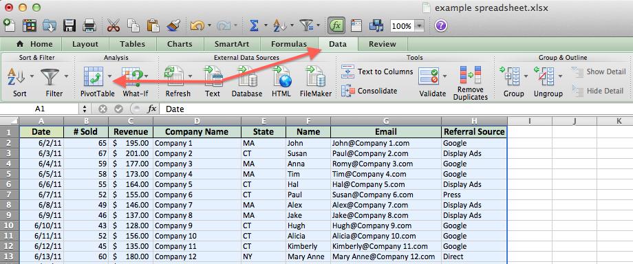
For example, I have put together a spreadsheet, which you can copy, and paste into Excel, or use in Google Docs if you would prefer (just click File > Make a Copy). The spreadsheet contains data with a mock company’s customer purchase information. For this example, we want to sort the data to see how much revenue we’ve made from each company. Since companies purchase at different dates, a pivot table will help us to consolidate this data to allow us to see total buys per company, as well as to compare purchases across companies, for quick analysis.
An Example Is Worth a Million Cells
First, let’s get the basics out of the way. The Pivot table allows you to take a table with a lot of data in it, and rearrange the table so that you only look at what’s important to you.
a) Whether you’re using a Mac or a PC, you can select the whole dataset that you want to look at, and select: “Data” -> “Pivot Table”. When you hit that, a new tab should be opened with a table.
Pro tip: If you’re using Windows you can push Alt + D + P + F on your keyboard).
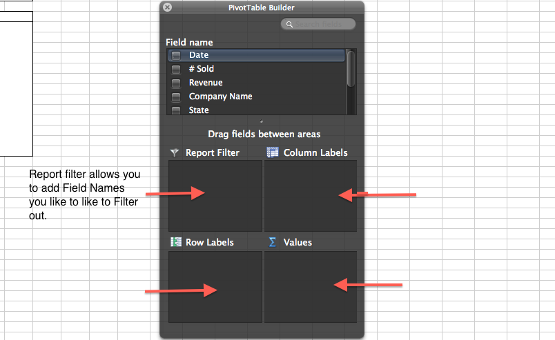
b) Once you have your table in front of you, you can drag and drop the Column Labels, Row Labels, and Report Filter
- Column Labels go across the top row of your table (for example: Date, Month, Company Name)
- Row Labels go across the left-hand side of your table [for example: Date, Month, Company Name (same as with column labels, it depends on how you would prefer to look at the data, vertically or horizontally)]
- The Values section is where you put the data you would like calculated (for example: Purchases, Revenue)
- Report Filter helps you refine your results. Add anything you would like to Filter by (for example: you want to look at Lead Referral Sources, but exclude Google and Direct)
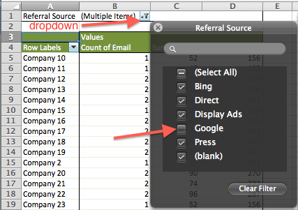
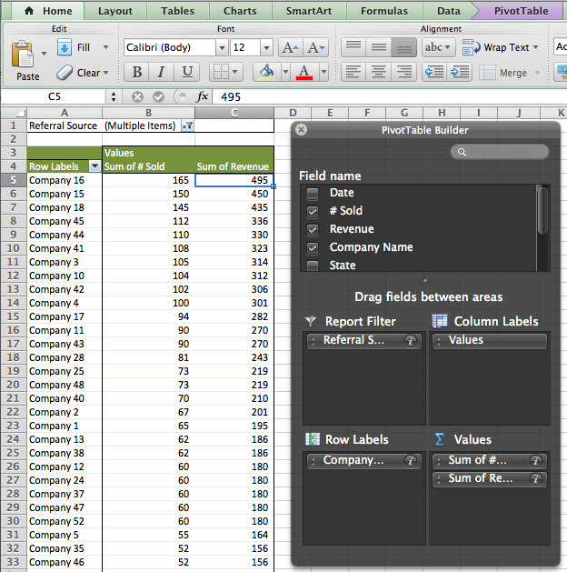
Alright, now what? Let me show you another example. In this report, I want to see the number of units sold (# Sold), and Revenue by company. I want to Filter out companies that came in directly to my site (as opposed to from a Referral, or from Google). To do this:
a) Add “Company” to Row Labels
b) Add “# Sold” and “Revenue” to the Values box
c) Add “Referral” to the Report Filter, then from the drop-down menu, de-select “Google”
This will generate a report that looks like this:
Next, I could add Date to the Column Labels box in order to look at what data companies were purchasing. If you do this in the example spreadsheet (linked to above), you can drag values down to Row Labels, below company to make it easier to view.
Pro Tip: If you want to look at who made the purchases in each company you can drag name and/or email to Row Labels below Company and that will show you the email address of the people who purchased from each company.
Conclusion
Pivot tables are a great way to manage the data from your reports. Play around with these examples to start. You can copy and paste the data into your own Excel file, or create a copy in Google Apps (File > Make a Copy).
Learning how to use pivot tables will speed up the rate at which you can produce sales reports, and at which you can analyze and close more deals faster. Stay tuned as we will be providing more information on more complex operations you can perform in Excel—with pivot tables—as well as other functions and formulas.
Do you have a use for Pivot Tables that you use for reporting? Share below. Also, feel free to post templates of reports you pull. You can do this through Google Apps Spreadsheets (make sure you set the privacy setting to how you like them).
Get sales tips and strategies delivered straight to your inbox.
Yesware will help you generate more sales right from your inbox. Try our Outlook add-on or Gmail Chrome extension for free, forever!
Related Articles


Casey O'Connor


Anya Vitko
![10 Best Persuasive Techniques for Sales and Marketing [2022]](/blog/_next/image/?url=https%3A%2F%2Fwww.yesware.com%2Fwp-content%2Fuploads%2F2021%2F07%2Fyesware-persuasive-techniques.jpg&w=1280&q=75)

Melissa Williams
Sales, deal management, and communication tips for your inbox