6 Excel Formatting Tips for Year-End Sales Reporting


By John Short, Marketer at Yesware
The year is coming to an end. That means time for that holiday bonus, maybe some extra vacation time, but before all that, you have to close out the year on a strong note. And even when you reach—and surpass your goal, you’re still not home free. Because you still have to do some year-end sales reporting in Excel before you can officially close the book on 2012.
To help make this task easier, we’ve compiled some tips on formatting these reports:
1. All Columns Should Be Created Equal
- Give your reports the professional polish they deserve by having all the columns in each tab an equal width. To do this:
- Select each column that you would like to make an equal width, make sure you are clicking and dragging from the very top row (with A, B, C, etc.) and that there is an arrow pointing down before you click and drag
- Then select the border next to one of the selected columns and drag until it is the proper width. Before dragging to you will again need to select the very top row and this time you should see an icon with arrows pointing left and right.
- Pro Tip: Excel will tell you what the width is exactly so you can apply the exact same measurements to all of your tabs (or where it makes sense in your report)
- When the data in the cell is too large for the width, you will get the “######”error. To fix this, increase the width of the cell by double-clicking on the column. This will adjust column width to necessary size in order to make everything in the column fit. You can also manually increase cell with by clicking and dragging the side of the cell until all the text shows up. You will want to go through every tab of your document before sending out
2. Standardize Coloring and Formatting
- Impress your boss with one consistent color and formatting scheme through out the document. Use your company’s colors when appropriate. If you deem it necessary to select a different palate, go with lighter tones that are easier on the eyes
- Before you save for the last time, make sure that each tab is ready for its close-up. Excel will open up for the next user in the way you left it. For example: If you leave a tab so that cell A1100 is that last tab you selected, that’s the tab your boss will see. Always select the top left cell (cell A1) before your final save and exit
- The Painter Brush allows you to select the cells that you would want to copy for formatting purposes. To use this feature repeatedly, simply double-click it before using, to turn off, just click the icon once. You can find the Pain Brush in: Very Top Row on a Mac, and: “Home” -> “Clipboard” -> “Paint Brush (icon)” on a PC
3. People Love Visuals
- Not everyone is into numbers. So don’t make your readers’ eyes bleed as they look number-by-number, cell-by-cell at your sales report. Mix it up, add some graphs and charts to the report
- We all prefer to see those graphs that go up and to the right (showing growth), but realize that you’re not always going to be able to generate those, if that’s not what your business is showing. Focus on being accurate and noting what the numbers indicate. Are you plotting growth over time? Cost per customer? Make sure to mark your axes
4. Group Rows and Freeze Cells When Necessary
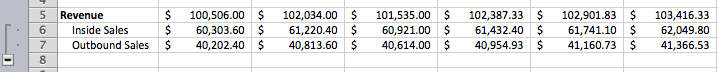
- A lot of people don’t know about the ‘Group’ feature, so stand out from your peers by putting it to good use. You can group rows to remove clusters from your reports. This is a great feature if you have secondary data that breaks down metrics in certain rows even more, for example you have a row showing Total Revenue, and you also want to have Revenue broken down in two sub-rows showing Revenue for Inside Sales and Outbound Sales. You can find Group in: “Data” -> “Group & Outline” -> “Group”
- Sometimes you will have a big table, and people will have to scroll far down to see all the data, including the row labels. For this you can select Freeze Cells so that as they scroll down, the row (and/or column) labels scroll with them. You can find Freeze Cells in: “Layout” -> “Window” -> “Freeze Panes”
5. Always Include a Summary Page
- Your Year-End Sales Reports are intriguing, really… but not everyone is going to want to go through each tab and read every element. Take the important pieces of information and summarize them in the first tab. Your executives will love you for it, and they’ll be able to drill down into the numbers that appeal most to them
- Be sure to include the key graphs and charts to make your summary page visually appealing! You want to capture your readers’ attention from the very first page—and entice them to read on
6. Number formatting Icons are Your Friend
- You will want to show revenue with the $ before, and likewise, you will want conversion rates to have the percentage symbol after them. Manually formatting this is a pain. Luckily Excel has made this easy. Select the cells you want to have a dollar sign in front and you can click the Dollar bills icon, or for your conversion rate you can click the percentage symbol and it will make it a percentage. The comma symbol will add commas. You can find the Number Formatting in: “Home” -> “Number” -> “Money/Percentage/Comma (Icon)”
- Adding and removing decimals works the same way. You select the row of numbers that you want to do this to and it will add and remove decimals one at a time. Make sure to keep your formatting of decimals consistent throughout your whole document. If you have Revenue with two decimals, do that in each Tab. You can find the Decimal Formatting in: “Home” -> “Number” -> “Decimal (Icon)”
Formatting makes a big difference in your presentation, and how people perceive the quality of your work. The quick tips above will help your reports look more professional and stand out from the rest. Those who are reading them will surely appreciate the effort you put in to enhance the readability of the content. It’s time to get to work on that report. Please let us know if you have questions in the comments below.
We created a Google Doc with some sample tabs for reports you can use in your own presentations. They follow the formatting tips provided above. Feel free to click-through and use for your own purposes by downloading or copying and pasting.
Get sales tips and strategies delivered straight to your inbox.
Yesware will help you generate more sales right from your inbox. Try our Outlook add-on or Gmail Chrome extension for free, forever!
Related Articles


Casey O'Connor


Anya Vitko
![10 Best Persuasive Techniques for Sales and Marketing [2022]](/blog/_next/image/?url=https%3A%2F%2Fwww.yesware.com%2Fwp-content%2Fuploads%2F2021%2F07%2Fyesware-persuasive-techniques.jpg&w=1280&q=75)

Melissa Williams
Sales, deal management, and communication tips for your inbox