15 Sales Dashboard Examples [+ Tips and Templates]

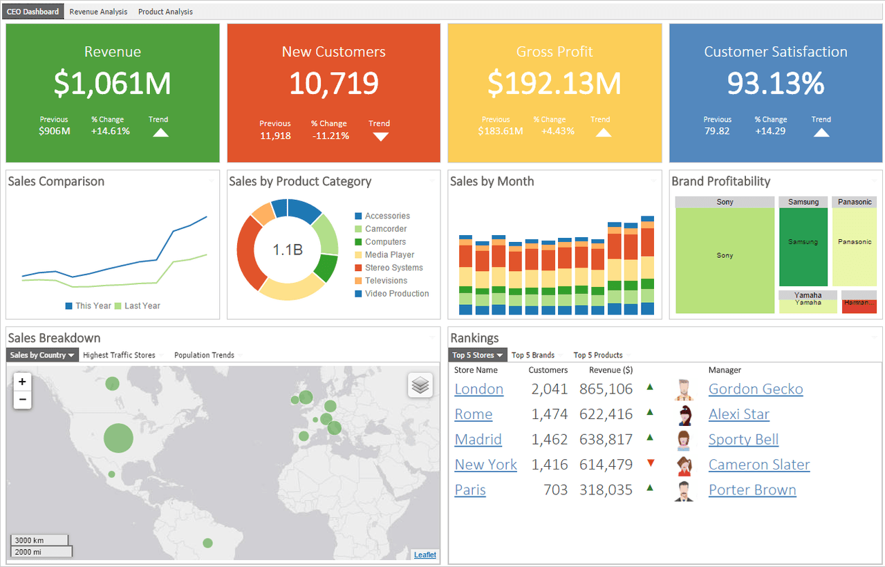
![15 Sales Dashboard Examples [+ Tips and Templates]](/blog/_next/image/?url=https%3A%2F%2Fwww.yesware.com%2Fwp-content%2Fuploads%2F2021%2F06%2Fyesware-sales-dashboard.jpg&w=1984&q=75)

A sales dashboard is a tool that aggregates sales data and formats it into aesthetically pleasing, easy-to-understand graphical form.
An accurate, versatile, and easy-to-use sales dashboard is critical for your sales team’s ability to understand and apply the data available to them.
In this article, we’ll go over everything you need to know about how to create your own.
Here’s what we’ll cover:
- What Is a Sales Dashboard?
- Why Do You Need a Sales Dashboard?
- What Should You Include in a Sales Dashboard?
- How to Create a Sales Dashboard
- 15 Sales Dashboard Examples
- Sales Dashboard Tips
- Sales Dashboard Templates
What Is a Sales Dashboard?
A sales dashboard is a visual representation of a given set of sales data:
Salespeople and sales managers collect and rely on massive amounts of data to optimize their sales processes and make accurate sales forecasts. The sheer volume of available data, though, can be overwhelming and difficult to digest.
That’s where sales dashboards come in. They give the salesforce and other c-suite executives the ability to see a wide variety of data at a glance, in a format that’s easy to read and draw conclusions from.
Sales Dashboard Software
The best sales dashboard software is capable of giving real-time updates to just about any set of sales data you might collect. This level of insight helps with a number of sales-related activities:
- Decision-making about sales strategies, sales goals, and forecasting
- Monitoring and controlling a huge variety of sales KPIs, all in one easily accessible place
- Knowing which members of your sales organization are in need of coaching or other intervention
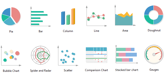
Not only do sales dashboards show a wide variety of data, many of them also offer the ability to customize their graphics. Sales teams can choose from the graphical representation that best suits a data set’s needs — things like pie charts, bar graphs, bubble charts, and scatter plots are all common features of most sales dashboards.
There are dozens — if not hundreds — of dashboard software available for sales organizations to choose from. Some companies also opt to create their own using Excel or other data-aggregation platforms.
Regardless of the route you choose, keep in mind that one of the most powerful features of a great sales dashboard is the ability to update in real-time and show you up-to-the-minute data. Even if you choose to create your own, be mindful about how readily available your data will be to your sales team.
Why Do You Need a Sales Dashboard?
Today’s sales professionals rely on massive amounts of sales data to create sales strategies, analyze deals, and move prospects through the pipeline.
In fact, there’s actually so much raw data that making sense of it all can become a full-time job in and of itself.
Sales dashboards make easy work of collating and analyzing the streams of up-to-the-minute data that help sales reps do their jobs effectively. Dashboards serve many important purposes, from motivating individual reps in their day-to-day tasks to informing big-picture sales strategy.
1. Helps Teams Make Informed Decisions
Sales dashboards are known for their easy-to-understand depiction of data. They’re also adept at pulling data from many sources and compiling it into a single, simple interface.
Decision-makers rely on sales dashboards to organize and streamline the data that will ultimately guide their strategy creation and execution.
2. Motivates Individual Reps
Sales dashboards give sellers up-to-the-minute reports about their daily activities and how effectively they’re using their time.
The right information on a sales dashboard can help sales reps see exactly which of their daily activities are most essential in growing the pipeline and closing deals. Dashboards help sales reps improve their productivity and effectiveness.
3. Contributes to Big-Picture Strategy
In addition to providing a rundown of daily activity, sales dashboards also give sales professionals a great snapshot of the bigger picture.
A bird’s-eye view of sales performance enables sales and marketing teams to strengthen or shift their overall sales strategies. They help the organization set clearer and more tangible goals.
4. Improves Accountability & Collaboration
Sales dashboards create a culture of transparency and common goal-setting.
When all departments can see the same data, it improves inter-department collaboration and alignment. The marketing department can see which campaigns contribute the most to successful sales.
5. Boosts Overall Sales Performance
All of the benefits that sales dashboards provide lead to improved overall sales performance.
They help all participants streamline the sales process by providing accurate, real-time sales metrics and KPIs whenever the team needs them.
What Metrics Should You Include in a Sales Dashboard?
One of the best things about sales dashboards is that there are nearly limitless possibilities about what kind of data they can process.
They can show high-level data, giving graphical representation to things like revenue growth, number of new customers, or win rate.
On the other hand, they can also drill down into very granular detail, shedding light on things like lengths of each stage of the sales cycle or time spent on sales vs. non-sales activities.
The way your sales dashboard appears will ultimately be up to the specific needs of your company. You may also find that you need to toggle between a number of different types of dashboards. Here are a few of the more common ways that sales teams choose to use their dashboard software.
Sales Performance Dashboard
This type of representation typically shows high-level, overarching sales metrics. You might see any combination of the following key metrics at a glance: total revenue, profit margin, sales growth, or closing rate.
Sales Conversion Dashboard
With this dashboard, the graphics shows the various conversion rates of each step of the sales pipeline.
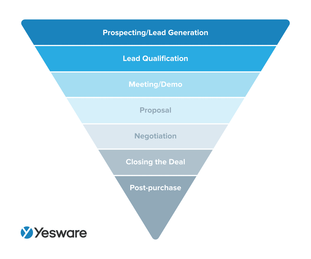
It may also show your lead-to-conversion ratio, converted leads, lead-to-opportunity ratio, or opportunity-to-win ratio. This data visualization helps team members understand exactly which stage of the process might need fine-tuning.
Sales Cycle Length
This dashboard template is pretty straightforward. It will show your sales team how long the overall sales cycle is. It can also depict how long each individual stage of the process takes.
Sales Leaderboard
A dashboard that lays out the current performance of your sales team can be highly motivating for your reps. A sales leaderboard will depict how each of your reps rank in terms of the metrics determined to be most impactful for your particular business.
Product Performance Dashboard
If your business sells multiple products, a product performance dashboard is a fantastic option for your team. This kind of dashboard can show COGs per product, revenue per product, or product sales by campaign.
Sales Activities Dashboard
If productivity is an issue for your team, a sales activities dashboard may help. These graphics can show the amount of time spent on the day-to-day sales activities like calls made, emails sent, deals closed, demos presented, and the number of follow-ups sent.
You may also consider including data sources for average activities per single deal; this metric gives you a benchmark for how much interaction customers generally need in order to buy.
Other Popular Metrics
Other popular metrics that may or may not fit into any of the above categories are:
- Leads by source
- Closed opportunities
- New business vs. upsell
- Win/loss rate
- Product gaps
- Open opportunities, open activities, and/or open cases
- Opportunities past due
- Sales by closed date
Regardless of which metrics you choose to include in your dashboard, try not to go overboard. The point of a dashboard is to make your data easy to read and understand; if you clutter it with every KPI under the sun, it may defeat the purpose. Remember, many dashboard software offers a variety of graphics and data inputs, so it’s okay to toggle between them as needed.
One more key tip: make your data actionable. Your sales team should be able to look at your dashboard, gather insights from the data, and be ready to do something with it — whether that means continuing with what’s obviously working, or pinpointing where and what needs changing.
How to Create a Sales Dashboard
Despite the fact that sales dashboards are ultimately unique to each individual company, there is a general process that your team can follow in order to determine how to create your own.
You will want to consider the following as you prepare to evaluate your various software/template options:
- The overall purpose of your dashboard
- Who will see the dashboard, how it will be used, and how frequently stakeholders will need to access it for updates
- Your format preferences — do you want a streamlined and minimalistic, or a one-stop-shop for your data needs?
- How much data you need to include
- The time period you intend to represent
With all of those in mind, the following basic steps will get you well on your way to your ideal sales dashboard.
1. Evaluate Your Sales Goals
Your sales dashboard should be a tool that shows you how close you are to reaching your sales goals.
If you’re concerned about sales productivity, it may not make sense to design a dashboard that shows high-level metrics like revenue growth or win rate — those are somewhat irrelevant until you figure out where your sales team’s time is being spent.
2. Consider the Stakeholders
Who will be the primary dashboard users? Upper-level management typically accesses higher-level data, while sales reps and managers may appreciate a more granular view of the process and day-to-day specifics.
You’ll also want to consider the overall purpose of the dashboard — are you using it to monitor basic progress, or rank and tier your sales reps? Make the dashboard work for you based on the highest priorities of your company.
3. Choose a Provider
We’ve included a variety of options for dashboard software providers in the examples below. There are also a number of Excel templates available for free or for a nominal fee. Make sure you have your goals, purposes, and stakeholders in mind as you evaluate your different options.
4. Integrate With CRM
Here comes the fun part. Once you’ve selected your software and trained your team in the specifics, plug into your CRM and let the data integrate.
5. Build Your Sales Report
Once you’ve linked the dashboard to the CRM, pull the specific reports to show the data you need.
Regardless of its primary users, the sales dashboard is meant to be a team-wide tool. There should be at least some level of transparency regarding how it was chosen and what data goes into it. Be sure to take the time to train your team on how to use the various features available to them.
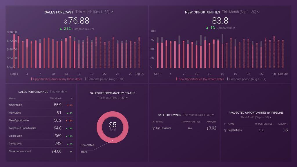
15 Sales Dashboard Examples
As promised, here are just a select few examples of beautifully arranged, data-forward sales dashboards.
The companies highlighted here also offer a number of alternative dashboard options, and there are still scores of other companies who may otherwise offer what you’re looking for.
The possibilities here are really endless, so don’t settle for a dashboard that doesn’t capture exactly what you’re looking for.
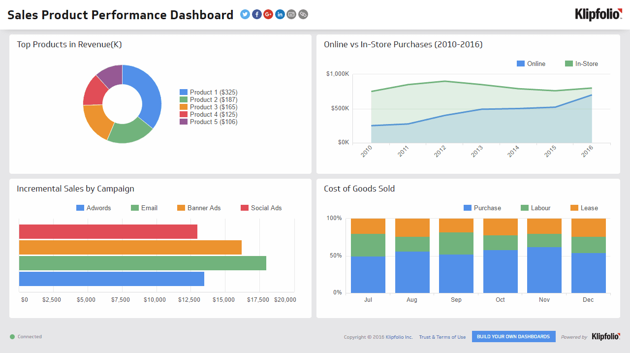
1. Sales Product Performance (Klipfolio)
This Klipfolio dashboard shows a handful of performance metrics for several different products. It also highlights the difference between online and in-store sales, as well as which campaigns were most effective.
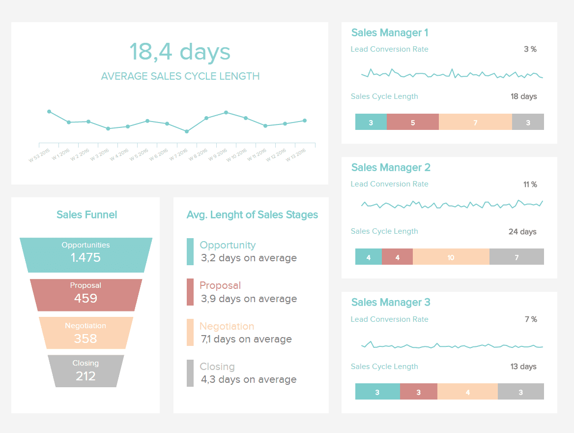
2. Sales Cycle Length (DataPine)
This DataPine chart breaks down the lengths of each stage of the sales cycle. Not only that, but it breaks this data further down by sales rep.
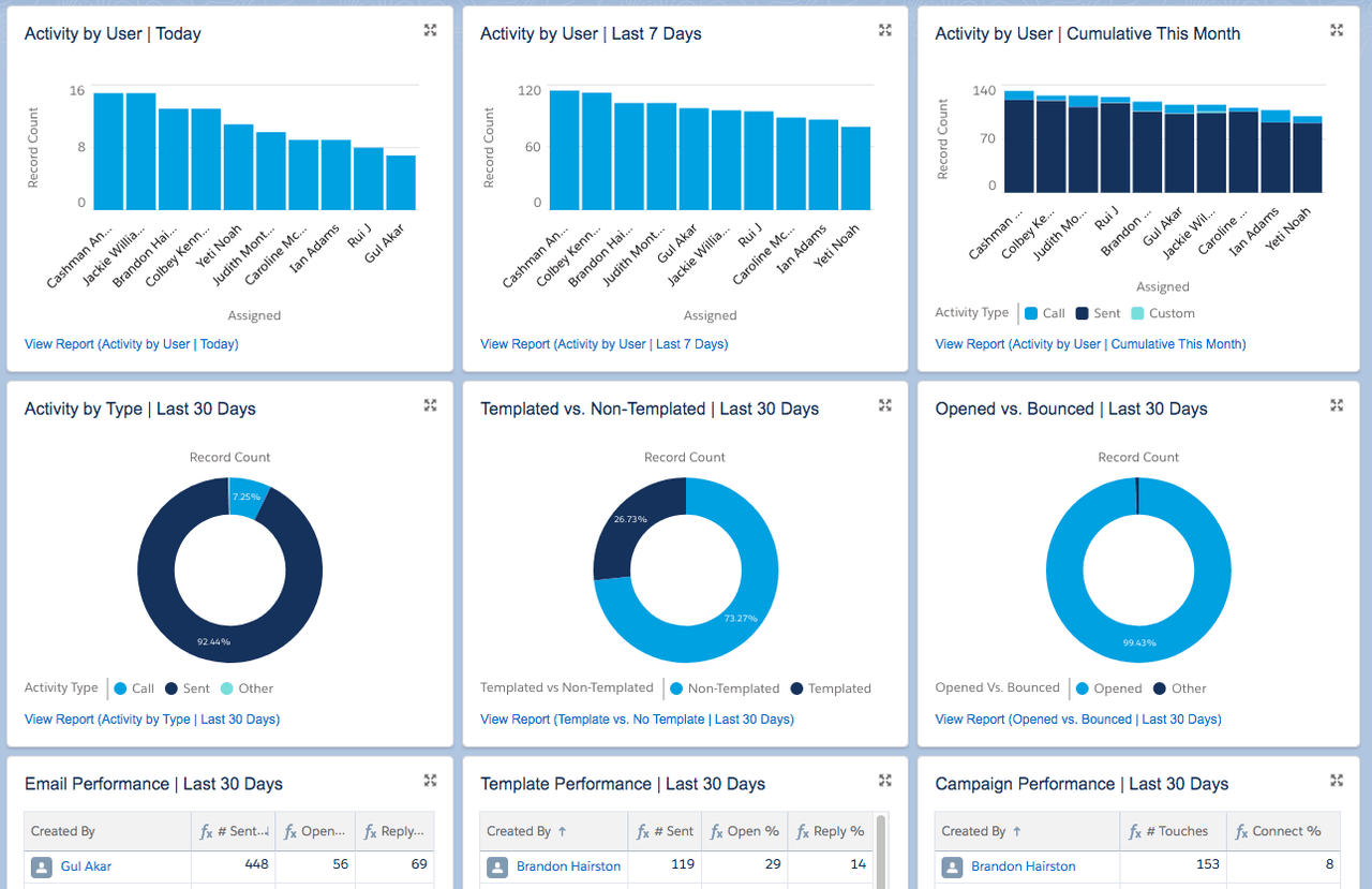
3. Sales Activities (Yesware)
Instantly visualize what’s working across your team with this Yesware + Salesforce dashboard. This dashboard helps you visualize email, call, and calendar activity across your sales team so you can see how rep activity leads to outcomes.
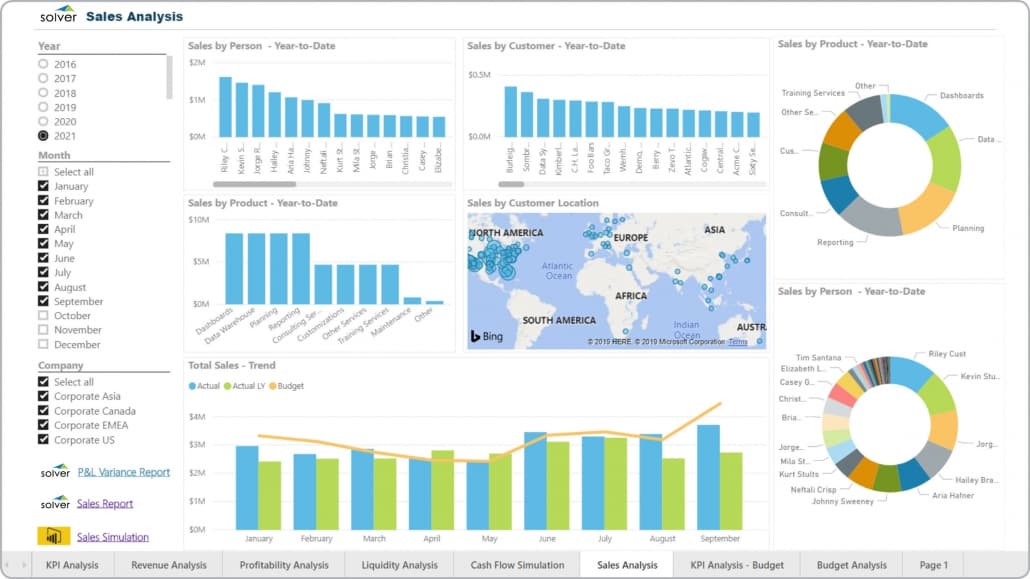
4. Sales By Metrics (Solver)
The next dashboard by Solver is a bit more high-level, showing a variety of “sales by” metrics — sales by customer, sales by rep, and sales by product — so you can see the top performers of each category. It also uses a line graph to show the overall sales trend.
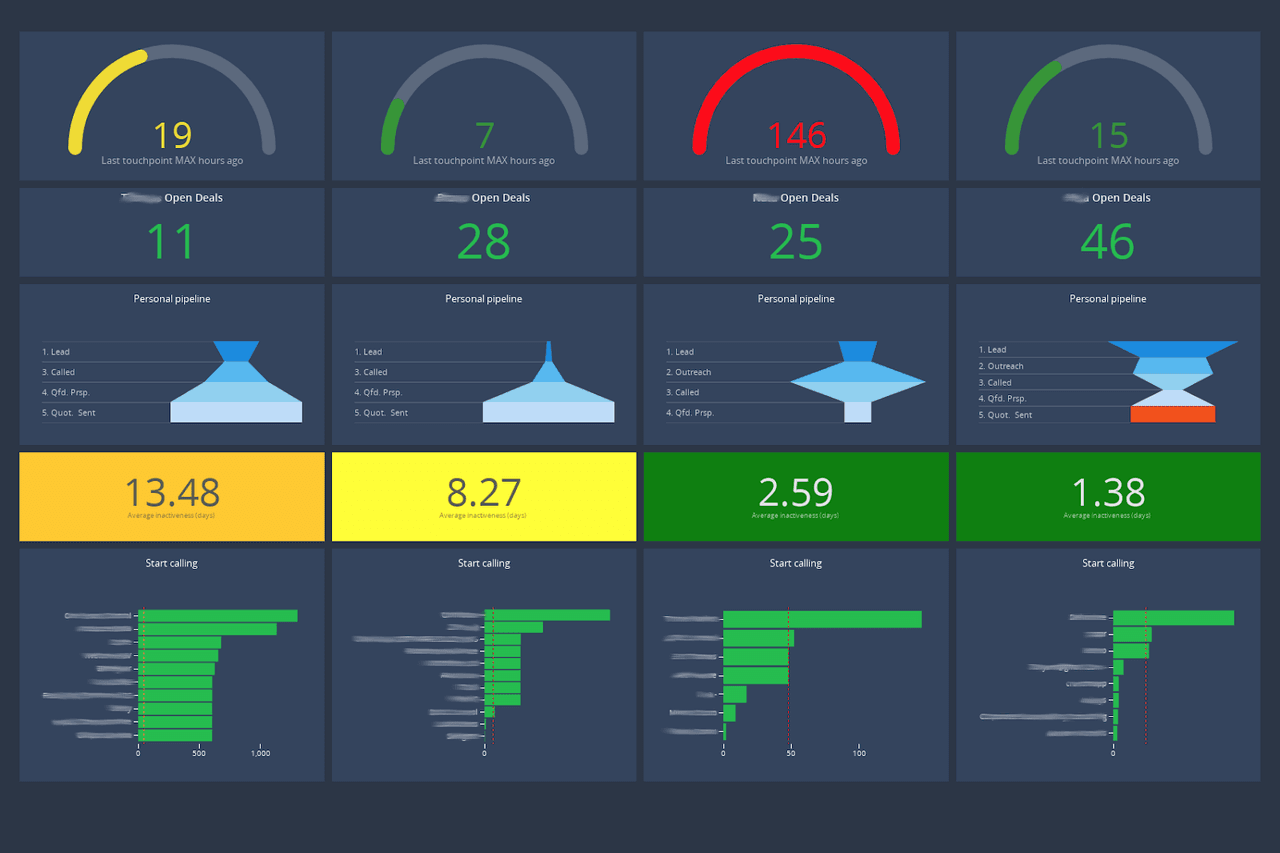
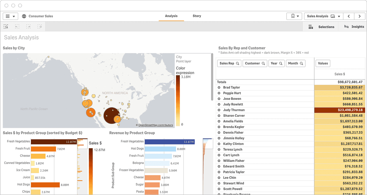
5. Sales Rep Dashboard (Cumul.io)
This Cumul.io dashboard shows high-level performance, broken down by rep. It details their personal pipeline details, as well as the number of open deals still being worked.
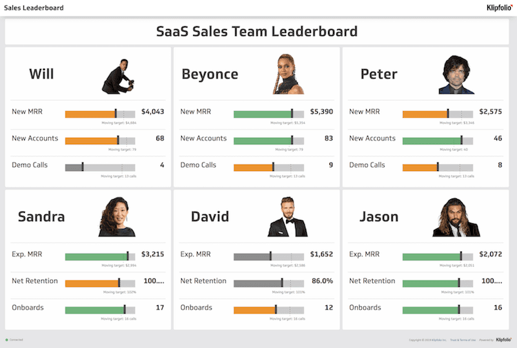
6. Sales Leaderboard (Klipfolio)
The following Klipfolio dashboard acts as a kind of scoreboard for sales reps. It highlights their company’s most impactful metrics: new MMR and new accounts.
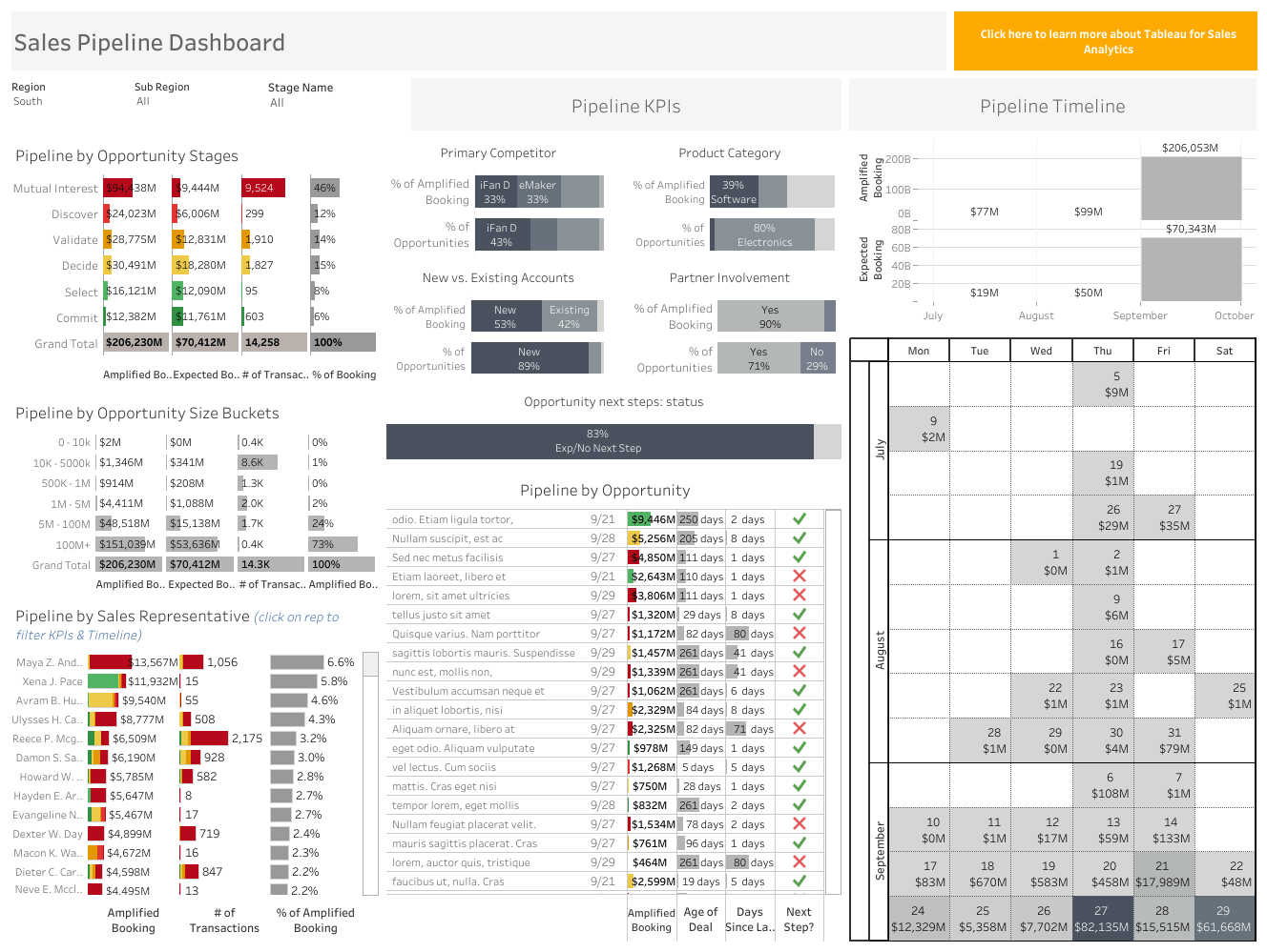
7. Sales Pipeline (Tableau Public)
Tableau Public designed this sales pipeline dashboard to break down the key metrics of the pipeline. From here, sales reps can see which stage is currently most successful, and which are slowing the cycle and may need specific attention.
8. Sales by Region (Qlik)
This Qlik dashboard sorts its data by geographical region. It also uses heat map technology to show which products perform best in different regions.
9. Performance Overview (Zoho)
Zoho offers a beautifully streamlined, high-level overview dashboard. It offers a few straightforward graphics, as well as key data points in easy-to-read formats.
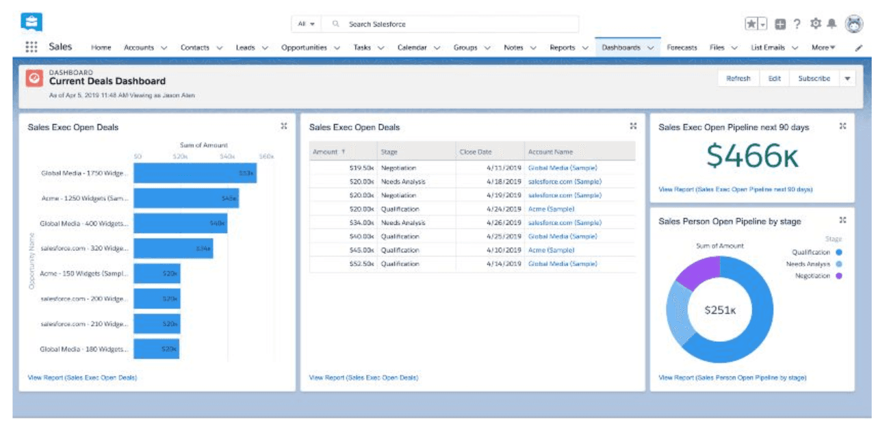
10. Open Deals (Salesforce)
This Salesforce dashboard shows that open deals can act as a kind of to-do list. It also adds a bit of motivation: if all of those open deals can close, the company will generate an additional $466k in revenue.
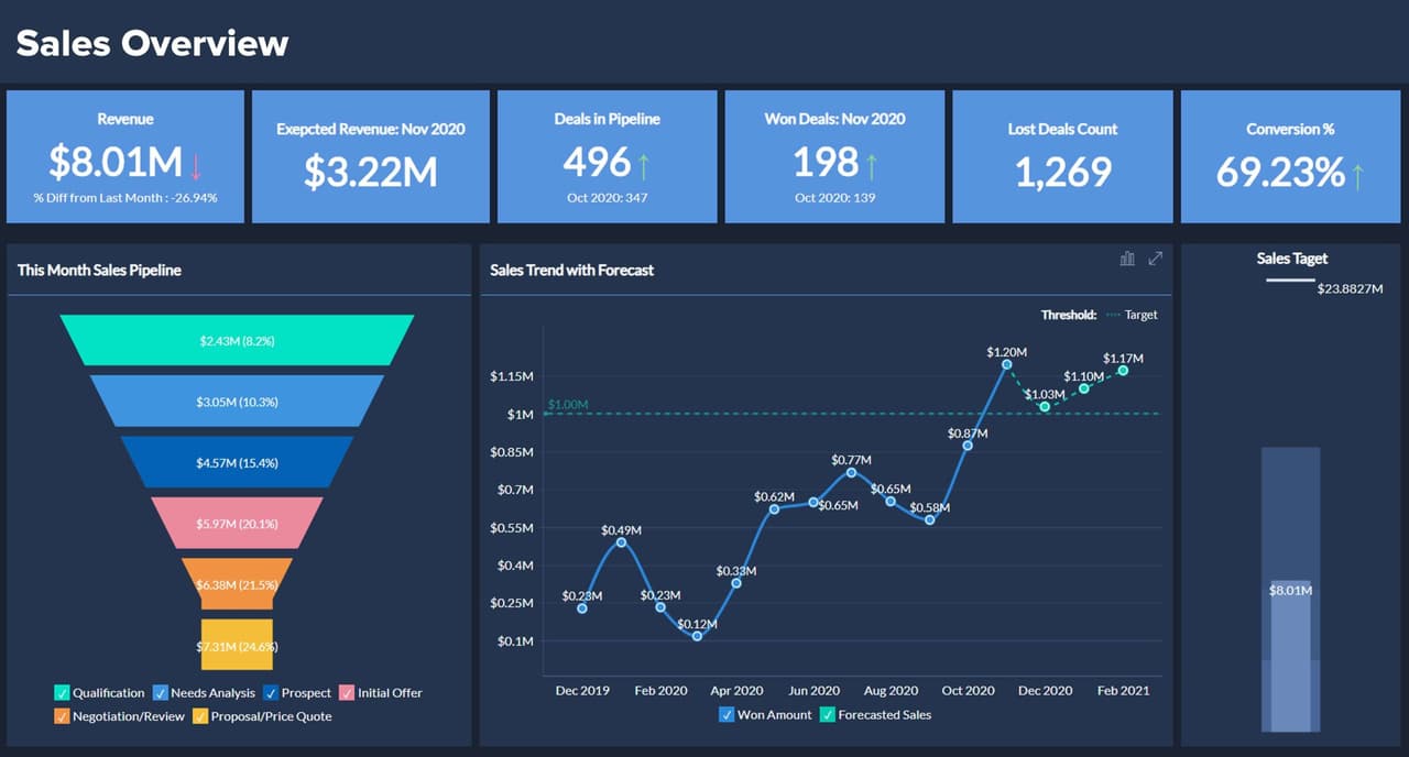
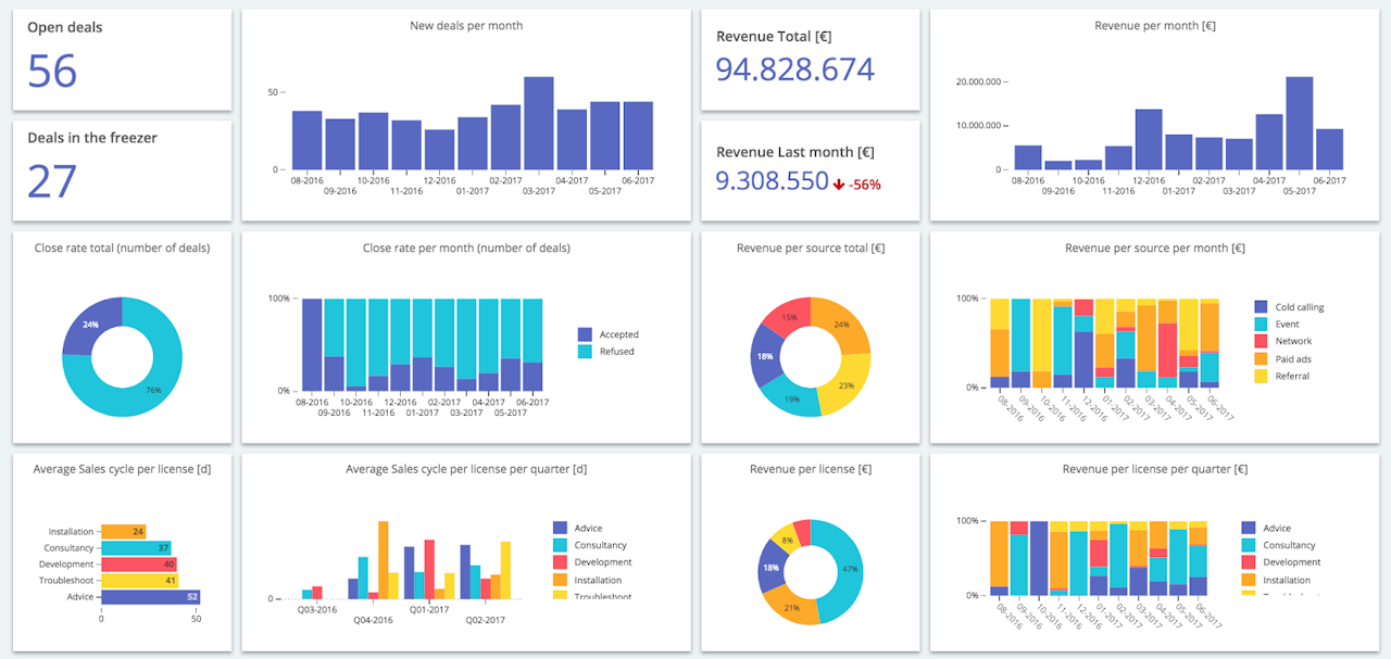
11. Sales Trends (Cumul.io)
This colorful dashboard by Cumul.io shows the overall trends and progress of your sales team. It’s broken down on a monthly basis.
12. Retail Sales (iDashboards.com)
Here’s a dashboard designed for retail sales by iDashboards, but it can be tweaked to represent non-retail, as well. It has sections for sales by location, sales by department, and sales per labor hour.
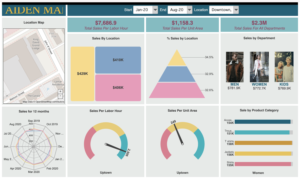
A sales dashboard can offer an almost immediate ROI in terms of time spent analyzing data. If you’re not already using one, now is a great time to start.
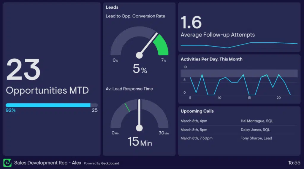
13. Individual KPI Dashboard (Geckoboard)
Some sales dashboard software platforms allow sales reps to create their own custom dashboard based on the metrics they’re targeting that month or quarter. This Geckoboard dashboard highlights the areas that “Sales Development Rep Alex” is prioritizing at this moment in time, like lead response time and the number of follow-ups.
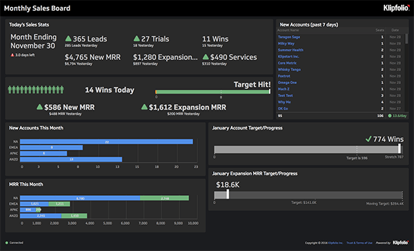
14. Monthly Sales Dashboard (Klipfolio)
This sales dashboard from Klipfolio gives users a nice big-picture and detailed look at the teams’ progress for that month. It details things like the number of leads, number of wins, new MMR, and MMR from current client expansion.
15. Source & Keyword Performance Dashboard (CallRail)
This sales dashboard from CallRail shows your most productive lead generation strategies. It’s particularly helpful to marketing teams, who can use it to pinpoint which of their campaigns are most consistently effective and most profitable.
Sales Dashboard Tips
With so many different dashboard options, there can sometimes be confusion among sales teams about how to best leverage this tool.
Here are a few tips to keep in mind as you implement your sales dashboard software.
Know Your Goals
Sales dashboards make the most impact when they’re specifically designed to help propel your team forward. With that in mind, make sure your teams have collaborated to develop SMART goals, which will help pinpoint the exact areas your team needs to focus on in order to succeed.
This goal-setting framework should help you determine which sales dashboard makes the most sense to analyze at any given time.
Layout Matters
Most sales dashboards display many different types of information, and they should manage to do so in a way that’s aesthetically pleasing. But they should also be functionally pleasing, as well.
The layout of your sales dashboard can have an impact on which information your teams interact with first, or with the most careful attention. In general, aim to put the most important takeaways on the top left, and move left to right and top to bottom from there. People’s eyes are trained to intake information much in the same way they read a book, so organize your data accordingly.
Furthermore, high-level, big-picture data sits best on the top half of the screen; details and day-to-day insights work best on the bottom.
Be Consistent
It may seem nitpicky, but try to keep your fonts, titles, headers, naming structures, etc. consistent across all of your different dashboards.
Sales dashboards typically distill tons of information into small, very easy-to-read data profiles, so the less “new” information the brain has to consider (think colored text or unusual fonts), the better.
It’s worth taking the time with your revenue-adjacent teams to come to a common understanding of department terms and milestones. What, for example, constitutes an “opportunity” — is it a lead that’s simply qualified, or one that’s heard the full pitch? Take the time to come to standardized definitions of all of your pertinent terminology.
Keep It Simple
Above all else, keep your dashboards simple. Remember that data itself is widely available in most sales organizations — cramming as much as you can into a dashboard isn’t the goal.
In fact, Gartner estimates that “bad data” — data that is incorrect, unintelligible, or non-productive — costs firms 30% of their potential income.
When in doubt, keep dashboards simple. There are plenty of layouts that will adequately show each type of data; it’s better to analyze a few against one another rather than trying to squeeze too much information on a single screen.
Sales Dashboard Templates
Although most sales dashboard software platforms offer a multitude of pre-created templates, many teams find the need to create their own dashboard templates to use on a regular basis. Here are a few of our favorites.
Quarterly Forecast Dashboard
A quarterly forecast dashboard offers teams a big-picture view of the various opportunities in the pipeline. This template should also position current progress against forecast data, and use the juxtaposition to pinpoint areas of strength and growth.
This dashboard is best used when creating and analyzing sales forecasts to assess for year-over-year (YoY) growth. They’re particularly helpful for sales analysts.
Sales Pipeline Dashboard
A sales pipeline dashboard helps users understand the health of the sales pipeline. You can use it to view progress in the different pipeline stages, assess progress on important KPIs, and get a sense of your sales cadence.
People across the sales team — executives, managers, analysts, and reps alike — will find this sales dashboard template helpful.
Sales Growth Dashboard
A sales growth dashboard helps sales managers see patterns or trends in their team’s sales performance. These insights can help the team create realistic and ambitious goals for growth.
These dashboards can filter growth by a variety of factors, including growth by region, market segment, or sales rep.
Sales Territory Assignments
A dashboard that focuses on sales territory assignments helps users understand the various KPIs affecting sales performance in a given territory. It helps sales managers balance workloads across their many territories.
Get sales tips and strategies delivered straight to your inbox.
Yesware will help you generate more sales right from your inbox. Try our Outlook add-on or Gmail Chrome extension for free, forever!
Related Articles


Casey O'Connor


Anya Vitko
![10 Best Persuasive Techniques for Sales and Marketing [2022]](/blog/_next/image/?url=https%3A%2F%2Fwww.yesware.com%2Fwp-content%2Fuploads%2F2021%2F07%2Fyesware-persuasive-techniques.jpg&w=1280&q=75)

Melissa Williams
Sales, deal management, and communication tips for your inbox